
Market Profile Trading: The Most Comprehensive Guide
When they see a Market Profile chart, many retail traders quickly turn their eyes aways as the distribution of letters seems too complicated for them to understand.
In reality, this is very far from the truth.
The market profile is relatively easy and straightforward to understand.
It just gives us a different look at the market closely tied to the Auction Market Theory.
Once you understand the building blocks, I show you in this article.
You will analyze markets very quickly by looking at previous distributions.
In my trading, I have met two types of traders.
Traders like me, who use Market Profile as the confluence tool with price action and orderflow.
And traders who really go deep into the profile and study different nuances, rotations, turning points, and they pretty much use Market Profile as their primary decision tool.
Because I don’t belong in this group, this article will show you all the key concepts used in Market Profile, and it will be up to you how you implement Market profile in your trading.
If you like this article, read the rest of the blog or join the Tradingriot Bootcamp for a comprehensive video course, access to private discord and regular updates.
For those who are looking for a new place for trading crypto, make sure to check out Woo. If you register using this link and open your first trade, you will get a Tier 1 fee upgrade for the first 30 days, and we will split commissions 50/50, which means you will get 20% of all your commissions back for a lifetime. On top of that, you will receive a 20% discount for Tradingriot Bootcamp and 100% free access to Tradingriot Blueprint.
You can either read the article, or watch the video version.
Table of Contents
Before we begin
Although I think that in this article, you will learn everything you need about Market Profile, you as a trader, should never stop learning and exploring new things.
If you are interested in how I personally use Market Profile as a confluence tool with price action and different orderflow patterns, go and check out Trading Bootcamp.
This article is the second part of the Auction Market Theory series; if you haven’t read the first one, you should do it now.
In a previous article, I have also mentioned a few books; here is a recap of those and some other resources.
These are namely:
- Steidlmayer on Markets: Trading with Market Profile, the 2nd Edition
- Markets in Profile: Profiting from the Auction Process
- Mind Over Markets: Power Trading with Market Generated Information, Updated Edition
- CBOT A Six-Part Study Guide To Market Profile
Recently I have read Profit with the Market Profile: Identifying Market Value in Real-Time by Dr John Keppler; this is very easy-to-digest book about Market Profile.
History of Trading With Market Profile
Market Profile was created in the early 1980s to create greater transparency for off-floor traders and attract new traders to exchange.
Peter Steidlmayer, which was at the time CBOT director was responsible for market information, believed that opening markets for a bigger audience could bring the growth of the financial markets and generate greater revenue and prosperity.
This idea wasn’t accepted by many on-floor traders concerned about their livelihood as they believed that market data and floor information were a privilege only for those trading on the floor.
Using the statistical bell curve, Steidlmayer developed a system that displays trading data from the market and shows activity happening during the trading session.
In 1985, Peter published the CBOT Market profile guide.
Although the Market Profile evolved since the 80s, the core principles remained the same.
The market profile becomes so popular a trading tool taught at Illinois University by Thomas P. Drinka.
Market Participants
Peter Steidlmayer not only created a market profile, but he also divided the market participants into two groups.
This is important because once we can recognize what market participants are in control thanks to Market profile opening and day types.
Different market participants have different motivations and are trading on different timeframes with different sizes.
Show who are they?
Short Time Frame Traders – STF
Those that are trading at the lower timeframes Steidlmayer called small, usually retail but even proprietary traders.
These scalpers/day traders don’t have enough resources and time to move prices.
Because of that, they spend the most time trading with each other around the Point of control as they consider it a fair value.
Long Time Frame Traders – LTF
Long Time Frame Traders (also called Other Time Frame (OTF) are the real movers in the market.
They are not interested in intraday price fluctuations, but they rather open positions for several days, weeks, months, and sometimes years.
Banks, hedge funds, or other institutions simply have much higher capital compared to STF.
They are opening large positions that influence momentum in the markets and move the price.
They cannot simply open a position whether they like; they need favorable prices to do so.
If they would just enter anytime, they could be easily front-runned, and they would experience large slippage.
Because of that, they need to wait and slowly build up their positions.
This usually causes markets to trend.
Identifying these two types of participants becomes relevant once we look at day types.
What is Market Profile?
Market profile is a unique way of organizing market generated information.
Professional traders often use it as they believe it is the best way to see an ongoing auction process.
As I just mentioned, a market profile is a tool to organize data.
It is not a trading system or strategy.
Although it is not a trading strategy, it helps us see trends and ranges in a clear picture.
In other words, the Market profile shows us where market participants agreed on the fair value of the underlying asset.
But it also shows the areas where the underlying was overvalued or undervalued.
Because the Market profile tracks both price and time, it shows us the market activity with the context of how it developed.
One of the significant advantages of a market profile is that it can be used in any market of your choices, such as Forex, Futures, Cryptocurrencies, or Stocks.
To display the data, the market profile uses TPO Charts.
Time Price Opportunity (TPO) – Market Profile
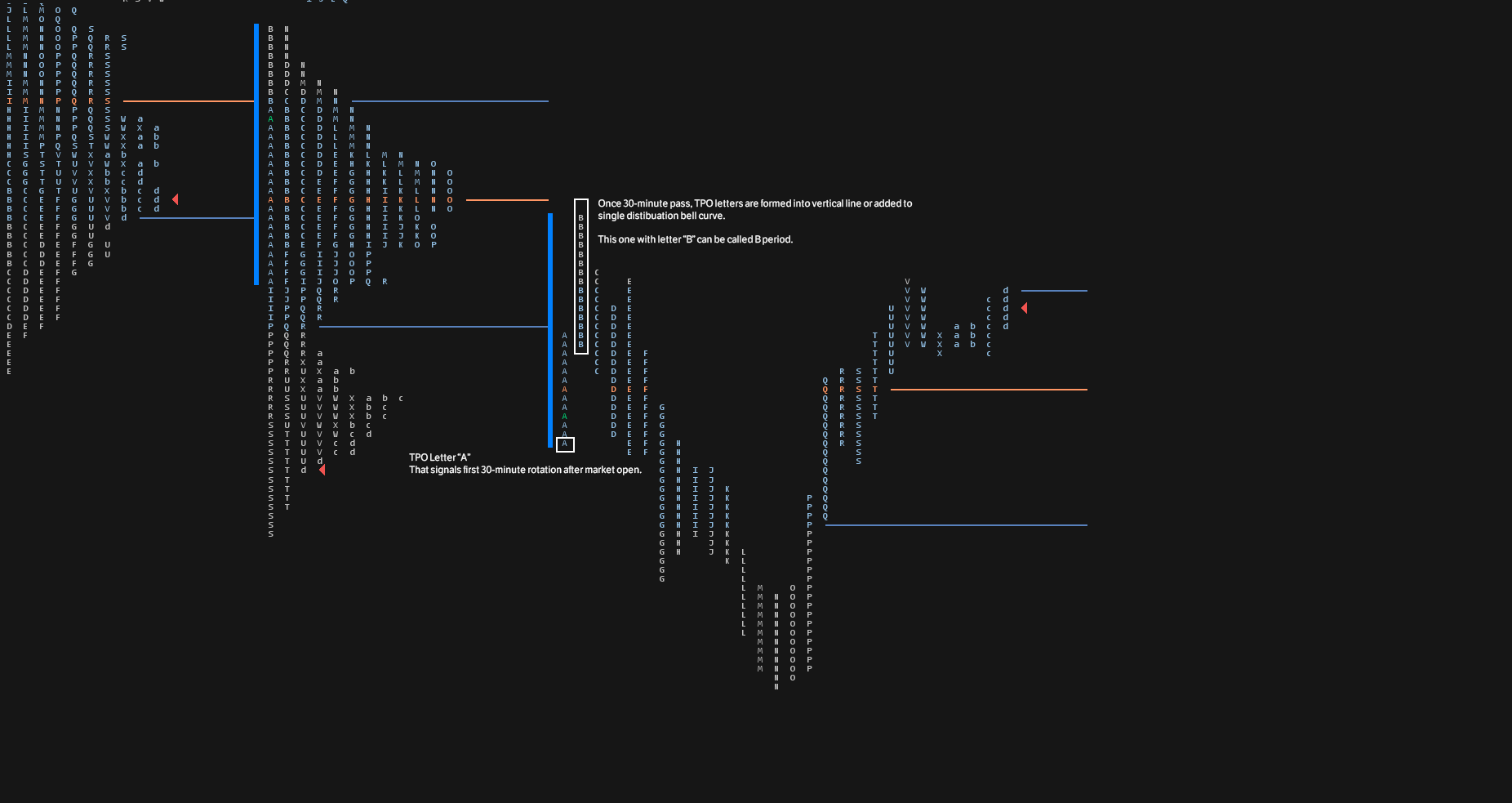
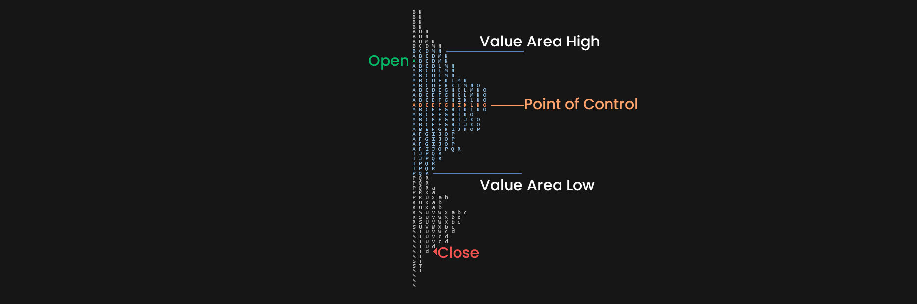
Time price opportunity (TPO) is a building block of a Market Profile chart.
Each TPO represents a point of time where the market traded at a specific price.
A single TPO is displayed on the chart every time the price touched it during the same period of time.
The default and most common settings of TPO are in 30-minute time intervals.
The same prices are displayed on the TPO chart only if the market returns to trade them during another 30-minute period during the trading day.
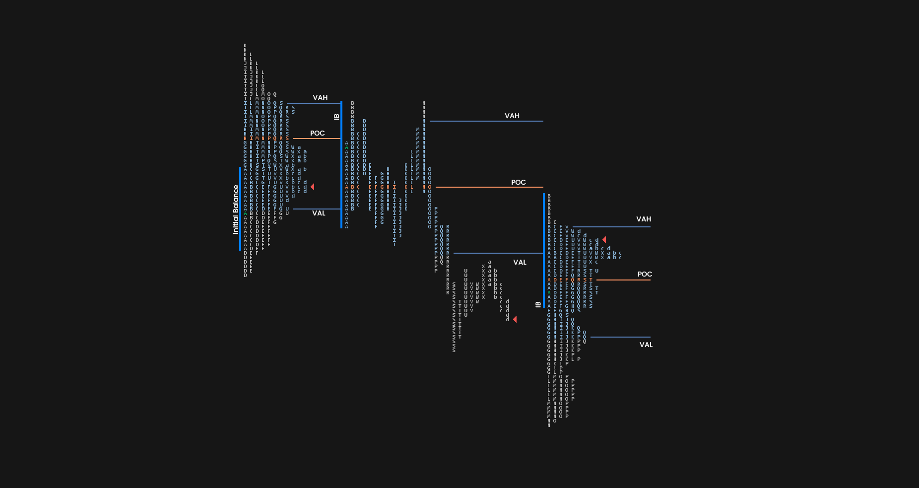
This picture gives us a unique way of looking at market generated information compared to candlesticks charts commonly used amongst traders.
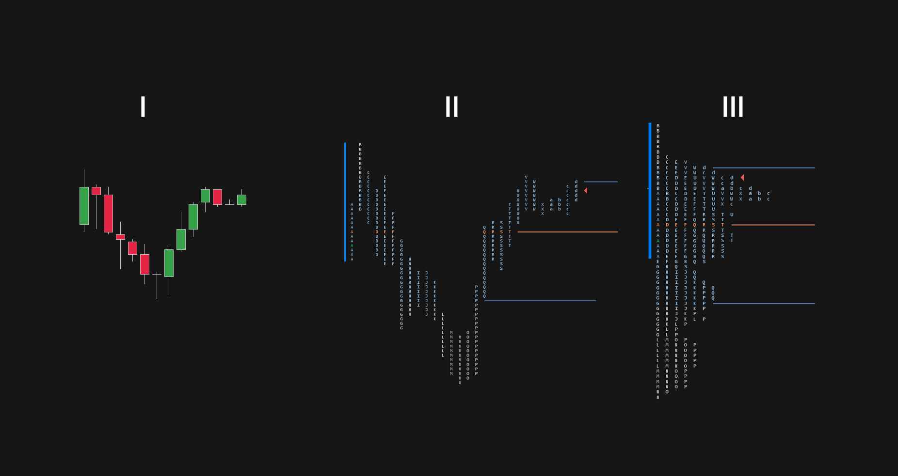
This picture shows one trading session in three different ways.
Picture number one shows what most of us are familiar with the candlestick chart.
In the second picture, you can see an expanded TPO chart starting with A period.
The green-colored letter shows us the price where the market opened for a given session.
The arrow at the right of the profile shows us the closing price.
Once sessions are finished, Market Profile can be collapsed to show us finished distribution.
Market Profile Value Area
If you read the Auction Market Theory article, you do know how the Gaussian Distribution looks like.
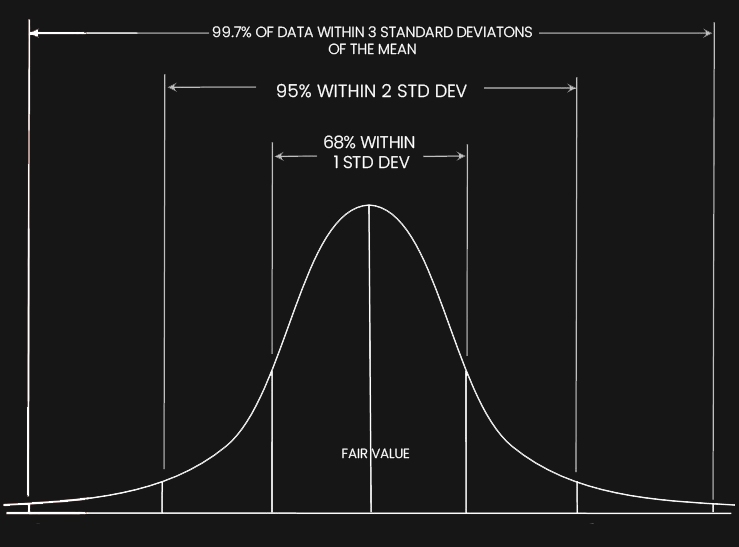
In the Market profile, the value area represents 68% of data within one standard deviation of the mean.
In other words, it is the area that contains 68% of the trades that occurred during a single session.
Because this is the area of prices where most of the activity happened during the session, we can say that in this area, buyers and sellers agreed on prices.
Market and Volume profiles are only tools that present us with value areas made in a nonsubjective way.
This gives us many advantages: Initiating and Responsive activity Acceptance and Failed Auction and AMT rules that I mentioned in the previous article.
In the center of the Value Area, we can find the Point of Control (POC)
Market Profile Point of Control
The point of Control is a price that is closest to the center of the value area.
Point of control functions as a major magnet for prices.
The greater the number of TPOs that make up the POC, the more significant it becomes.
This is often called a prominent point of control.
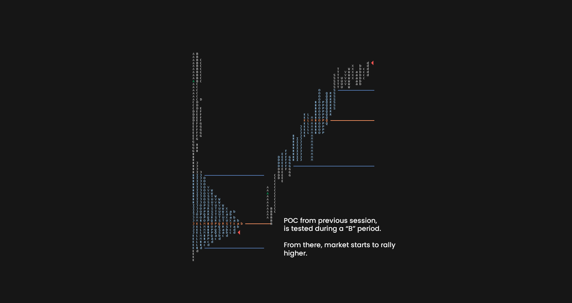
Same as with other trading concepts, Points of control are best when they are fresh and untested.
These are called the Naked Point of Control (nPOC).
As you can see in the image in the image above, there are 2 significant points of control that were not tested before.
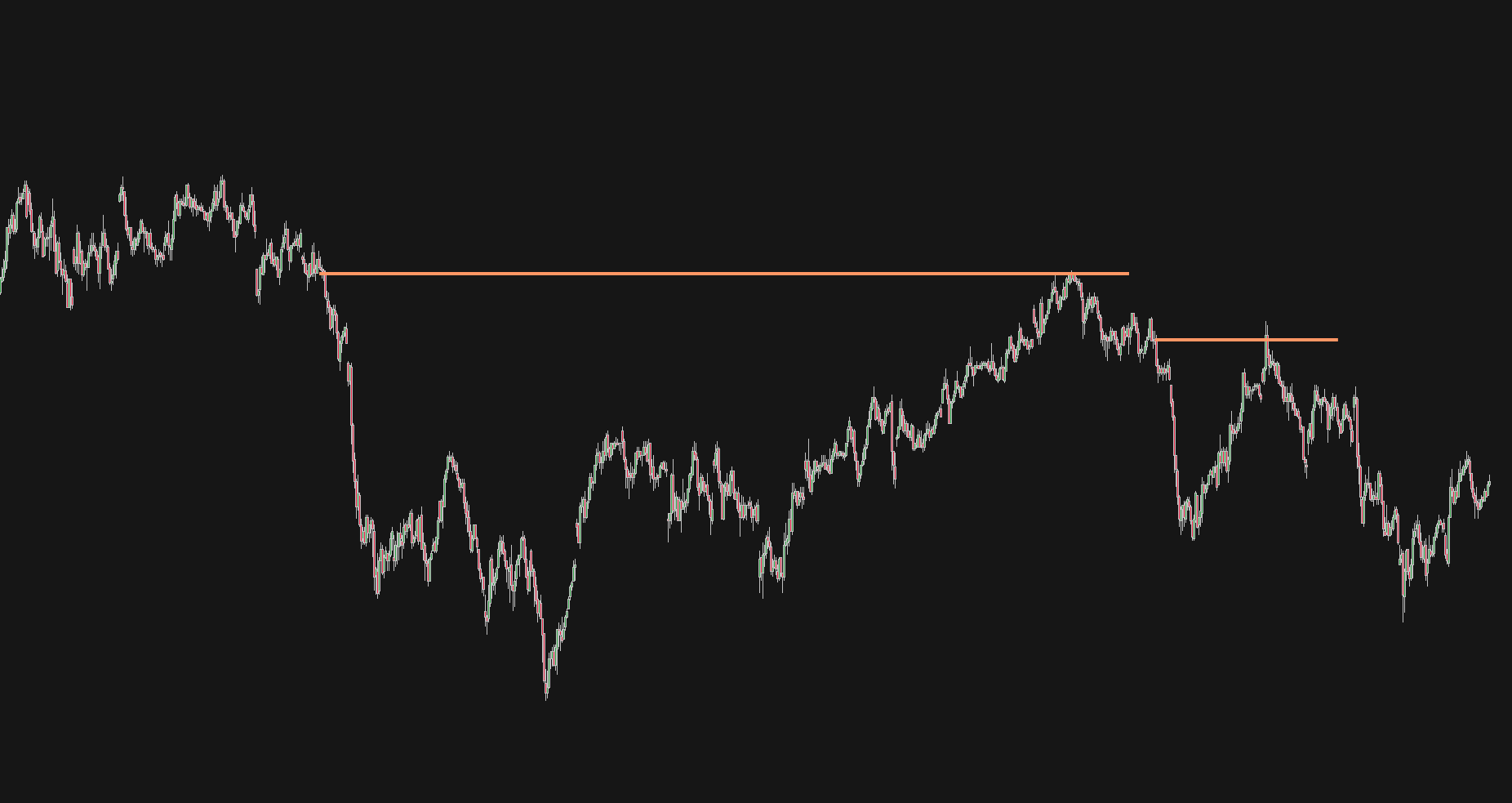
If we put these naked points of control on a candlestick chart, you can notice how they correlate with supply and demand areas’ breakouts.
The great advantage of using a Market Profile is that you end up with market generated information instead of your subjective levels.
Initial Balance
Initial Balance (IB) is a range where price spent its first two TPO periods after the open.
In other words, the initial balance is a range of the first hour after the market opens.
The initial balance came up from floor trading as floor traders looked at the different ranges after the market opened.
We can watch range extensions outside the Initial balance to grasp and the idea of who is in control.
- Move below the Initial Balance indicates control of large time frame sellers.
- Move above the Initial Balance indicates control of large time frame buyers.
As you can see, the initial balance is represented by a blue line showing a range of A and B period which are the first two TPOs in a Market Profile.
Days with a wide Initial Balance gives us early signals of range-bound days.
Days with a narrow Initial Balance gives us early signals of trending days.
Initial Balance in Futures
Initial balance in the futures market works best because markets have well-defined trading hours.
For European indices such as FESX, DAX, or German Bund, we use the first hour from 8 am to 9 am GMT+1. This time is based on the open of the Eurex exchange in Frankfurt, Germany.
US equity indices such as S&P500, NQ, or YM have their initial balance during the first hour from 9:30 am till 10:30 am Eastern Time. This is open to the Pit trading session.
The last two heavily traded markets are Crude Oil and Gold.
For Crude Oil initial balance sets up between 9 am to 10 am ET.
Gold opens at 8:20 am ET, so we are looking to mark the initial balance between 8:20 am, and 9:20 am ET.
Initial Balance in Forex
Because forex is a 24-hour market, marking out the initial balance needs some testing.
There are three options you can do when trading forex to mark out the initial balance.
- The first hour after the new day starts at 00:00 UTC
- The first hour of the London Session Open from 7 am to 8 am UTC.
- Asian Session Range from 00:00 to 7 am UTC
There are pros and cons to all of them.
The first hour at day start is universal, and it’s technically where the session started.
On the other hand, there is not really much going on during those hours.
The first hour after London open makes a bit more sense due to higher trading volumes in that period.
At the same time, an argument could be made that if we are marking out London open, why don’t we mark our New York open?
Asian session range might be actually the best way to do things.
There is a popular London breakout strategy that profits from breaking out of an Asian range and the initial balance goes tandem with that.
So what is the best choice?
That’s up to you; you should test all of these yourself and find out what works best for you.

Initial Balance in Cryptocurrency trading
If you are trading Bitcoin or other cryptocurrencies, the Initial balance is set at midnight UTC.
Market Profile Specifics
So now that you know what Value Area, POC, and Initial Balance are.
There are a few other special anomalies we can identify on the TPO chart.
Failed Auction
The failed auction occurs when the Initial Balance low or high is taken out, but the market fails to sustain the breakout.
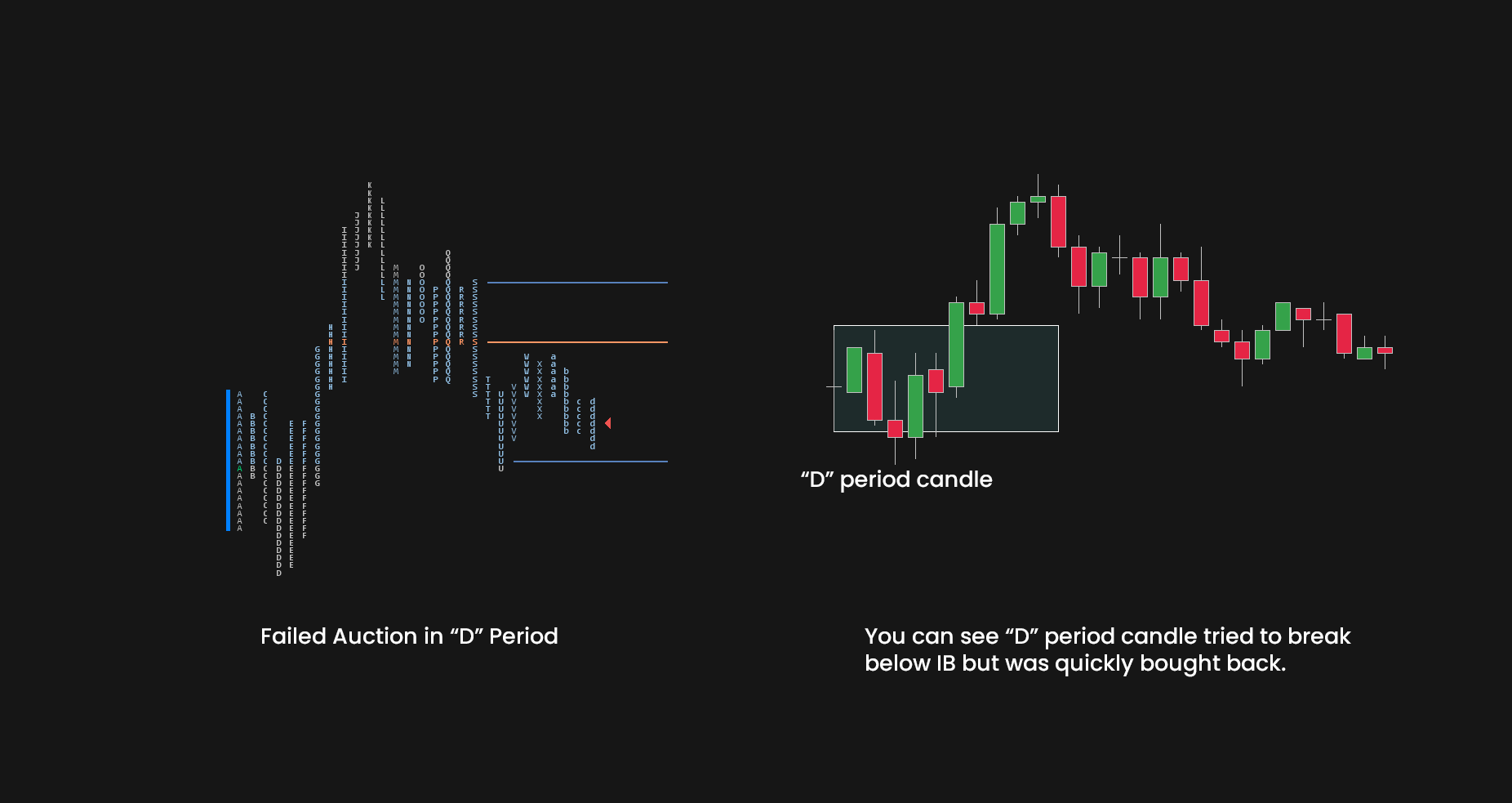
When the market breaks outside the Initial Balance but fails to hold the momentum for more than 30-minutes and enter back into Initial Balance, we can expect the opposite side of IB to get tested.
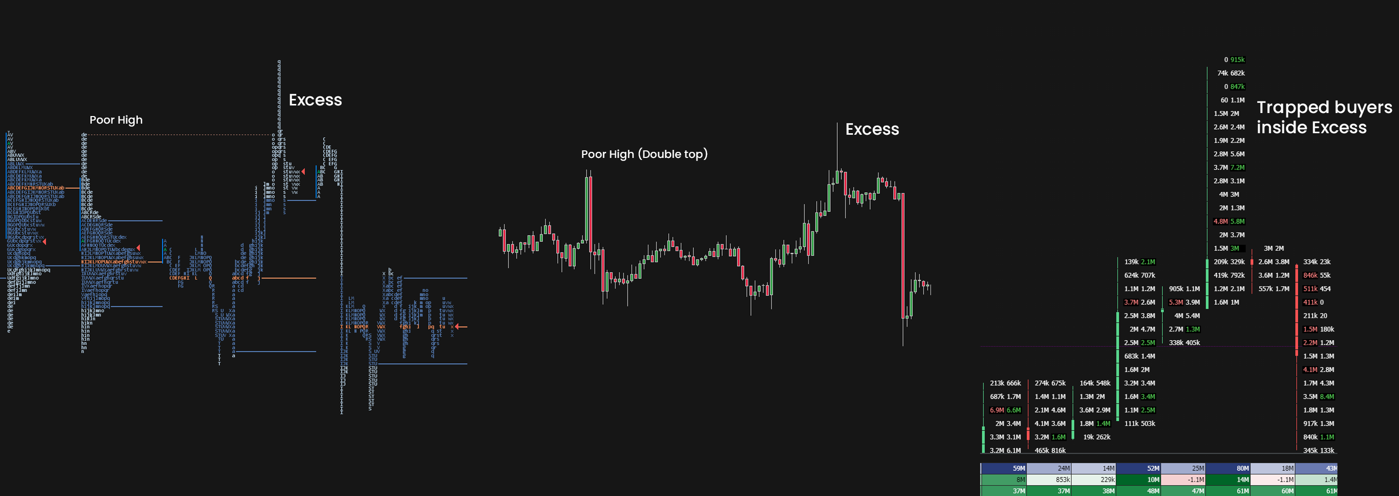
Excess
Excess is seen at the tops and bottoms of the profile, and it indicates the end of the auction and the start of a new one.
On the candlestick, chart excess is represented with a 30-minute candle with a long wick.
Another word for excess is buying/selling tail.
A buying tail tells us that responsive buyers are stepping in below the value.
A selling tail tells us that responsive sellers are stepping in above the value.
The longer the tail, the higher the conviction of buyers/sellers.
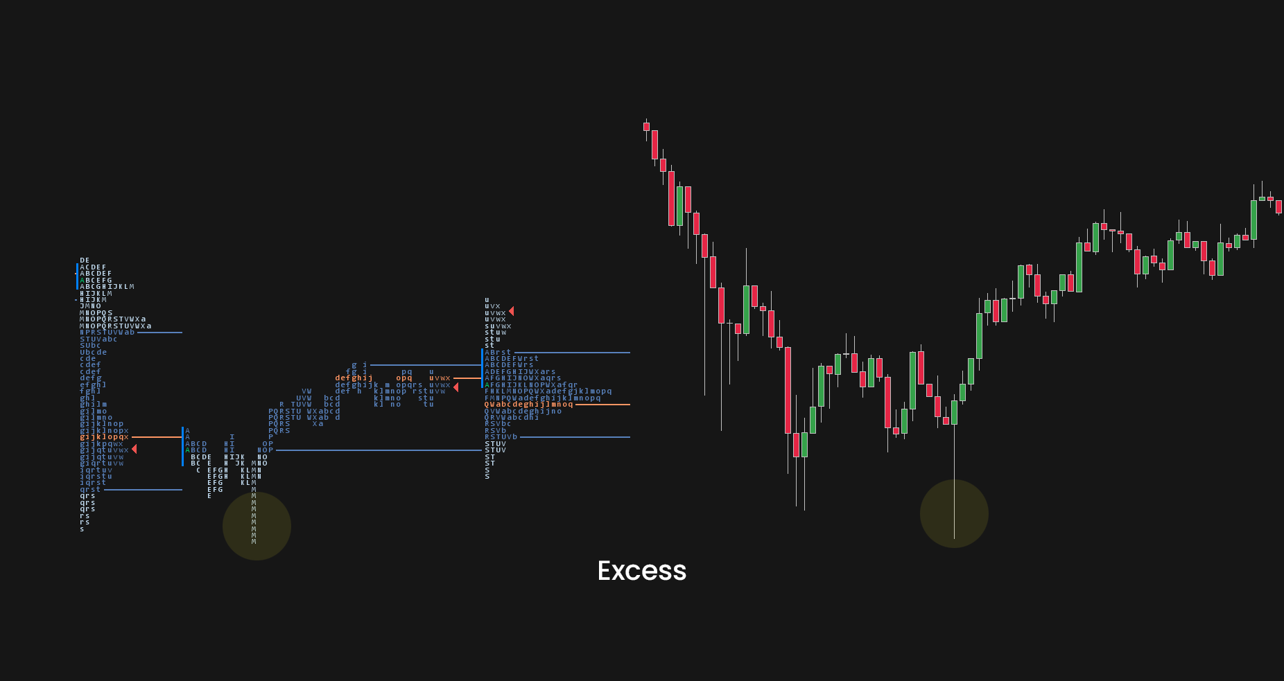
As you can see in the picture above, in the “M” period market broke below a previous day value area low, once we traded below the previous day low, we found responsive buyers stepping in.
Excess works best with the context of market trading into key reference points such as previous day/week highs and lows, fixing poor high/low, or testing naked POCs or other key support/resistance areas.
When you are trading an Excess, you should be looking at Volume Imbalance at the Footprint chart.
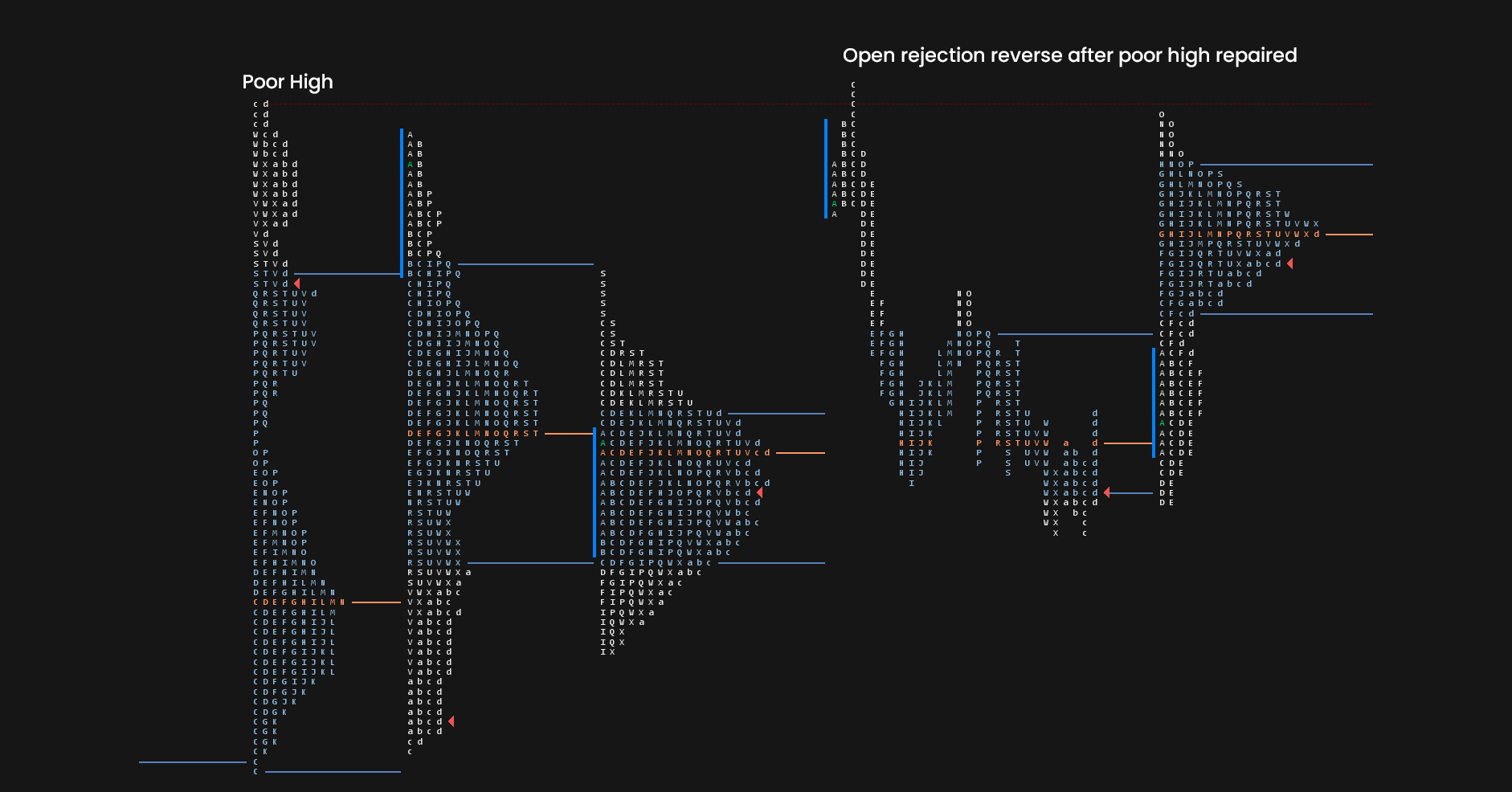
Poor High/Poor Low
Poor high and poor low can be considered as a lack of excess.
We can see these when the market has low confidence in the current direction.
Showing no tails and conviction of traders stepping in.
Poor highs and lows are often revisited.
You can identify poor high or poor low with two or more TPOs at the top or bottom of the profile.
On candlestick charts, these would be short term double tops and bottoms.
As I mentioned in the Supply and Demand article, liquidity resting above these levels adds more fuel to the market once poor highs/lows are repaired.
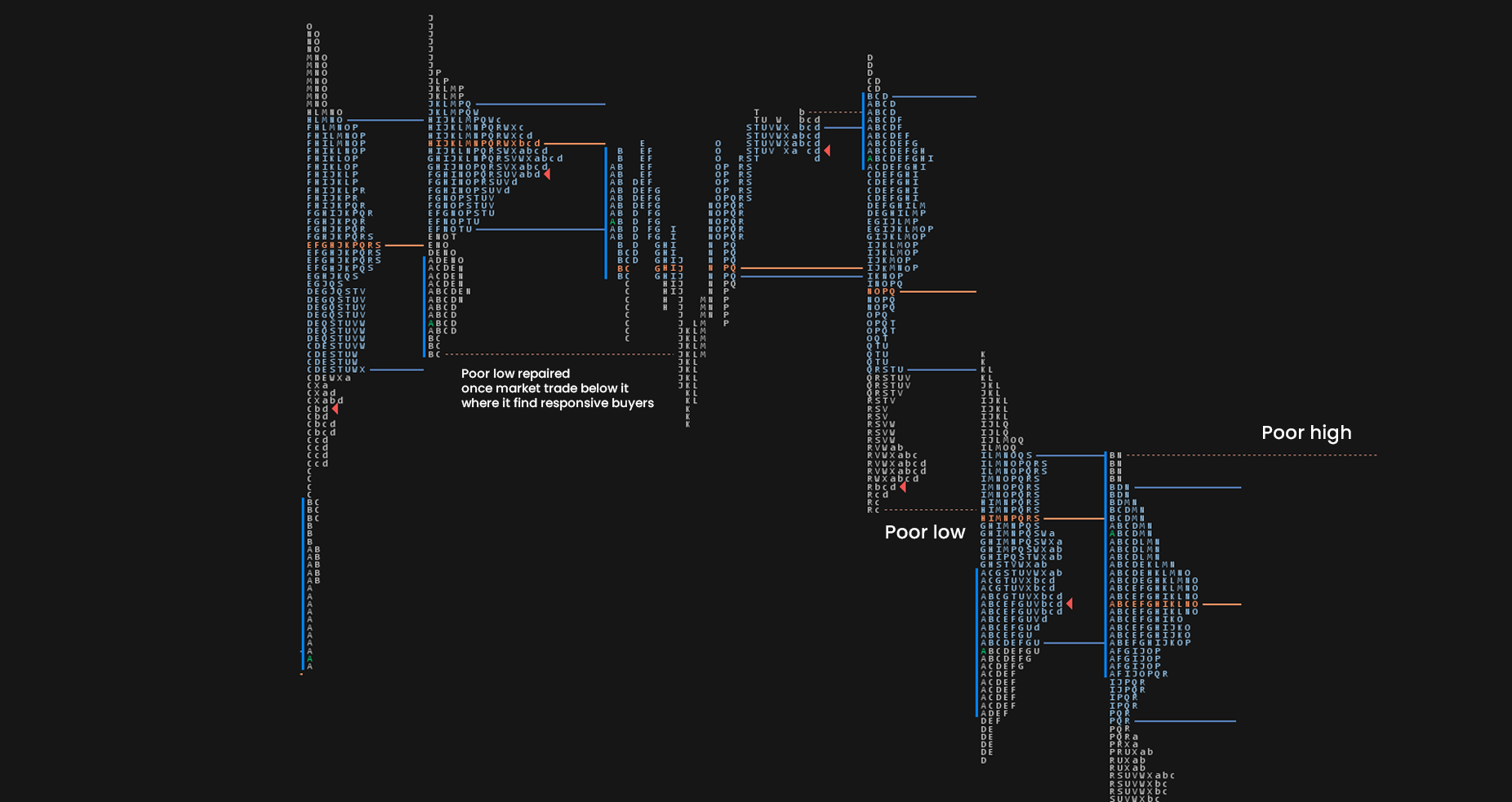
As I mentioned, poor highs and lows work very well with excess and understanding the patterns on footprint charts.
If you are interested in how exactly I use these in my day-to-day trading, you can check out the Trading Blueprint.
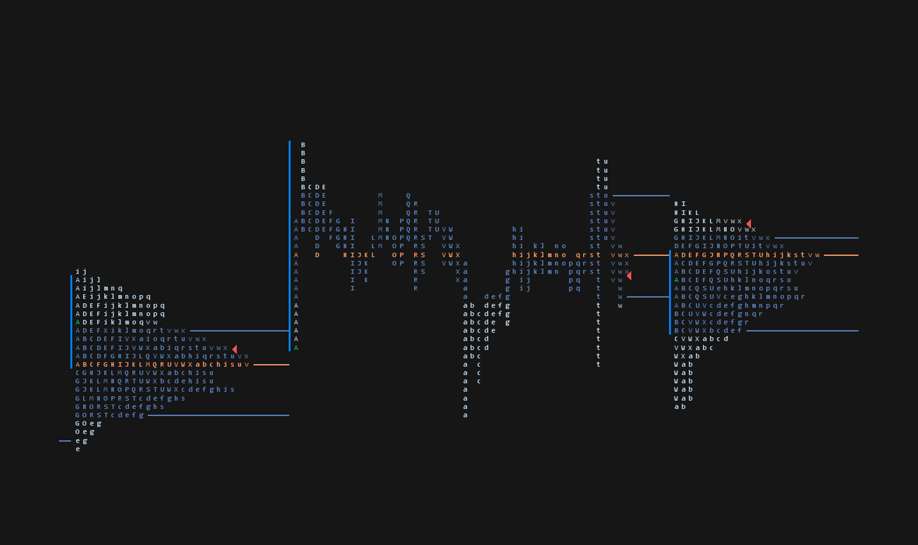
Single Prints
Single Prints (singles) are the same as excess but happen inside the profile.
They are represented with single TPOs printed on the Market profile.
They leave low volume nodes with liquidity gaps, so they tell us that market moved too fast through the area.
These inefficient moves tend to get filled, and we can seek trading opportunities once they get filled, or we can also enter before they get filled and use these single prints as targets.
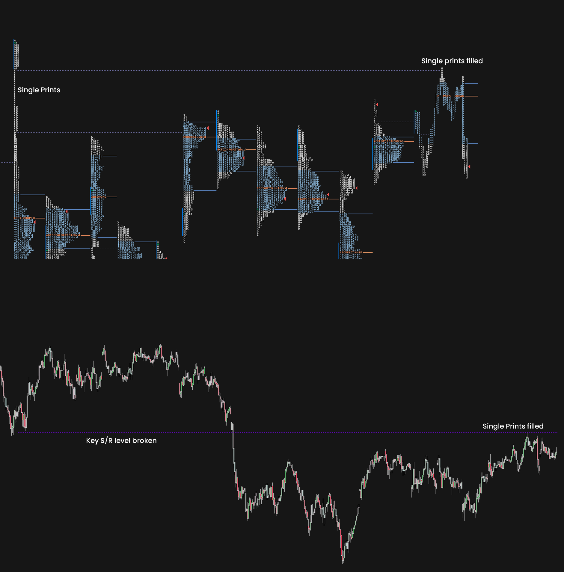
Once again, adding the candlestick chart to the mix, we can clearly see that market was not only filling the single prints but also testing prior support as resistance.
This gives us a perfect trading opportunity.
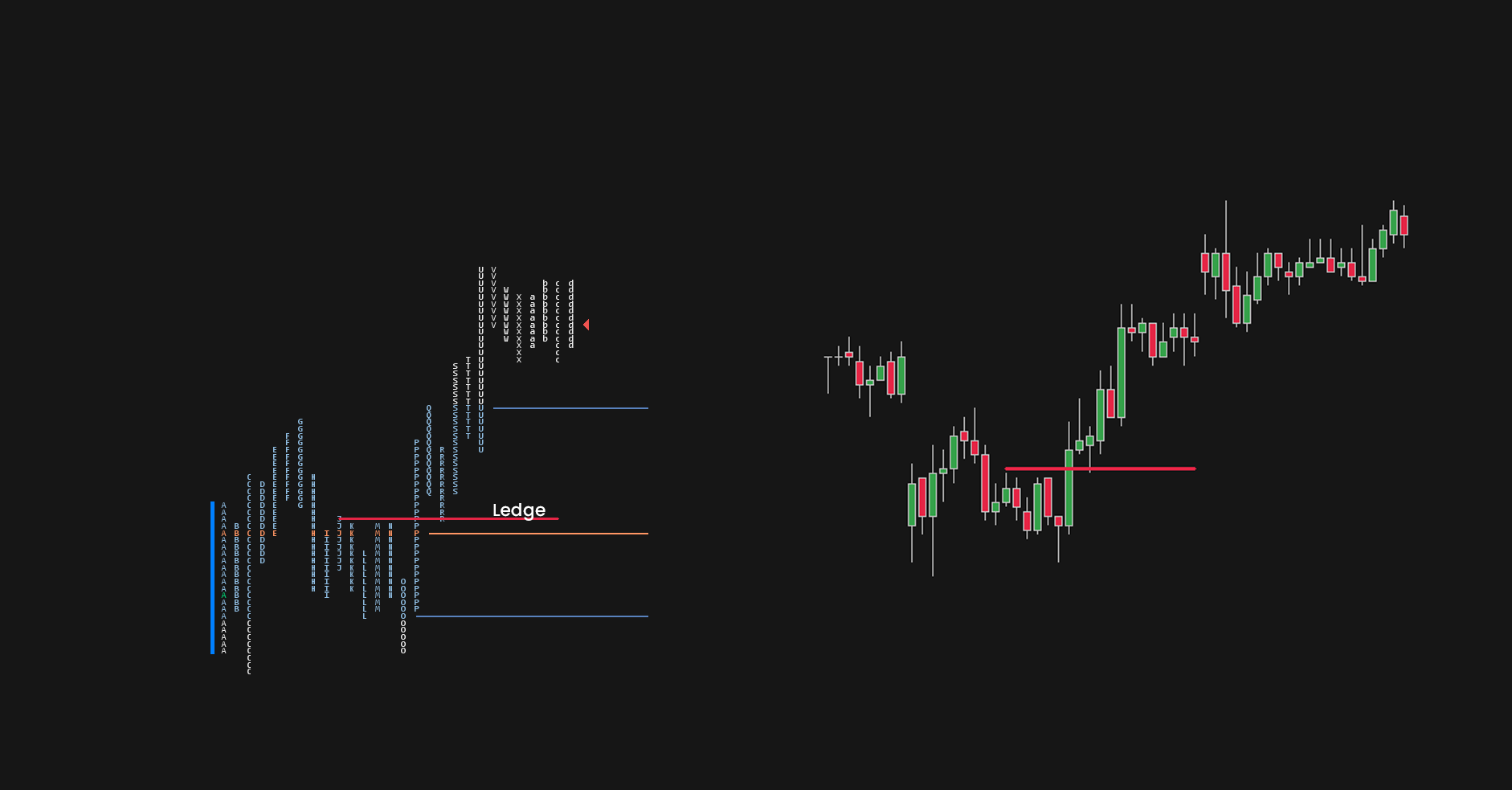
Ledges
Simply put ledges are visually the same as the poor highs and lows, but they form inside the market profile.
It is an area where price stopped and formed two or more TPOs at the same price and formed a ledge.
Ledges are a great way to visualize strong support and resistance areas as the price was rejected at least two times there.
Once those areas are broken, we can use them as entries the same as S/R flips.
Market Profile Day Types
Based on the initial balance of the session, we can divide days into different categories.
One of the key benefits of learning different day types is that once we identify them early in the session, we can have an educated guess of what we can expect until the end of the day.
Non-Trend Day Structures
There are pretty much two types of market profile structures, trend, and non-trend days.
On non-trend days we have Normal Day, Normal variant of a normal day, neutral day, and neutral day.
Do you need to identify all of these?
In my honest opinion, you don’t.
Thus, I will only cover the normal and neutral day; of course, you can read more about the other two in Market profile books.
Normal Day
The little misleading name since Normal day is very rare to see in the market.
During a normal day, the Initial Balance is very wide, and any attempt of breaking outside of it gets cut off quickly.
This tells us that Large Time-frame Traders (LTF) entered the market in the first hour of trading and are not interested in participation anymore.
Short Time-frame Traders (STF) are very active in their day trading/scalping, but they don’t have enough power to break through the IB.
Neutral Day
Compared to a normal day, the neutral day has a smaller IB.
The same as a normal day it does not provide any direction, but it usually exceeds the range of initial balance as buyers/sellers try to find a new value.
But this initiative action often attracts stronger buyers/sellers that return price back to the value.
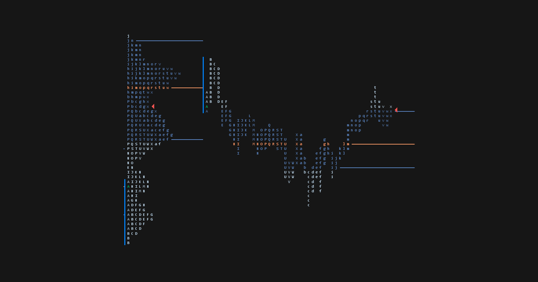
As you can see, the market opened with wider IB, and shortly after sellers broke below the previous day value area low.
This initiative selling was met with responsive buying, and we closed the session back inside the value area from the previous day.
Standard (Trending) Day Types
These represent examples of a directional day in the market.
During the standard trend day, there is a high degree of direction and confidence.
These are important because once we identify trending day, it can help us to latch on to existing trade and more importantly, not trying to blindly fade it.
Trend Day
LTF in control the whole day.
They are signaled with a small IB which is broken, and the market starts to look for new fair value.
Because of the strong movements, the market usually leaves single prints and low volume nodes that often get filled and act as support/resistance areas.
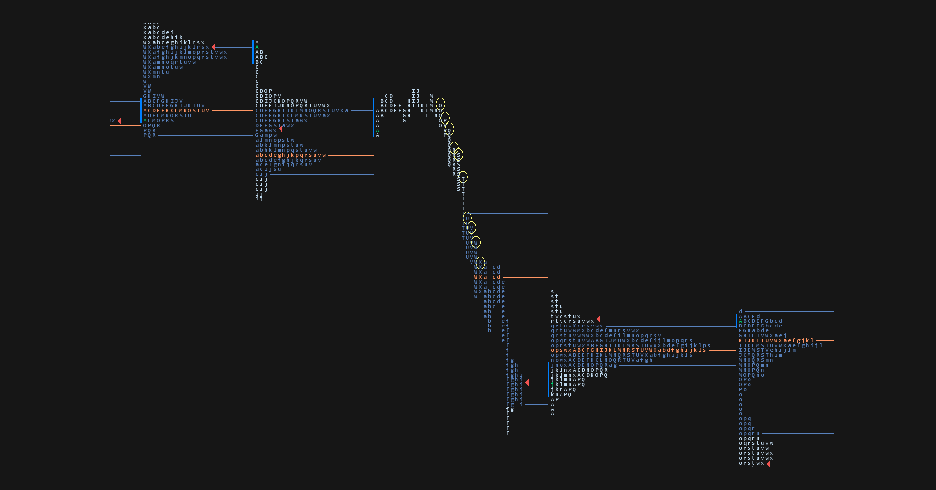
As you can see, the market broke below narrow IB and rallied lower throughout the whole day.
Yellow circles highlight something called one-time framing, this means that no previous TPO high (or low) was taken out during the move.
This signals a strong trend that shouldn’t be faded.
Double Distribution Day
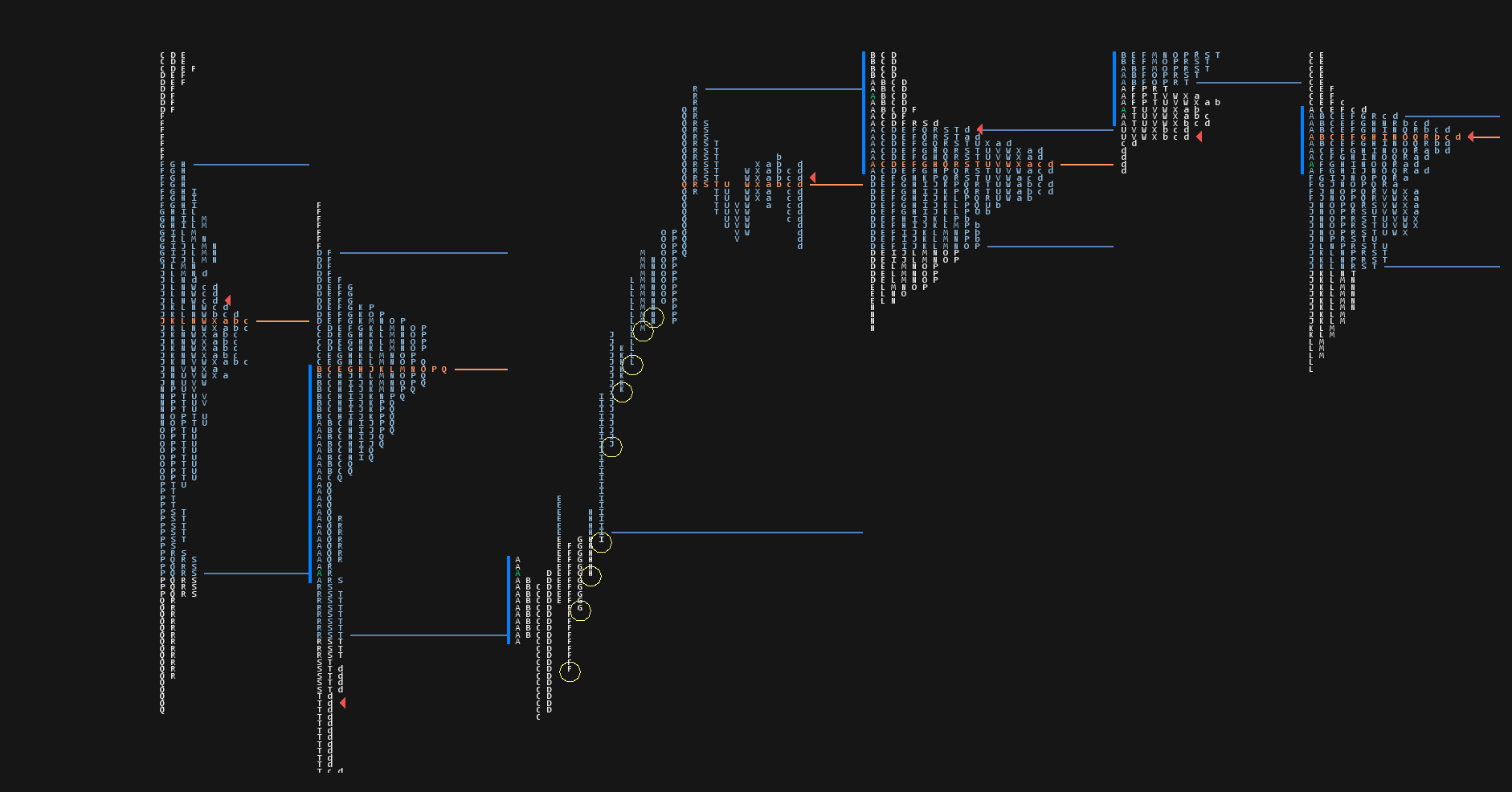
As you can see on this day, we made the first distribution when we tried to break below the previous day VAL, but buyers stepped in and drove the price higher throughout the day.
Yellow circles signal one-time framing until the market slowed down and made the second distribution.
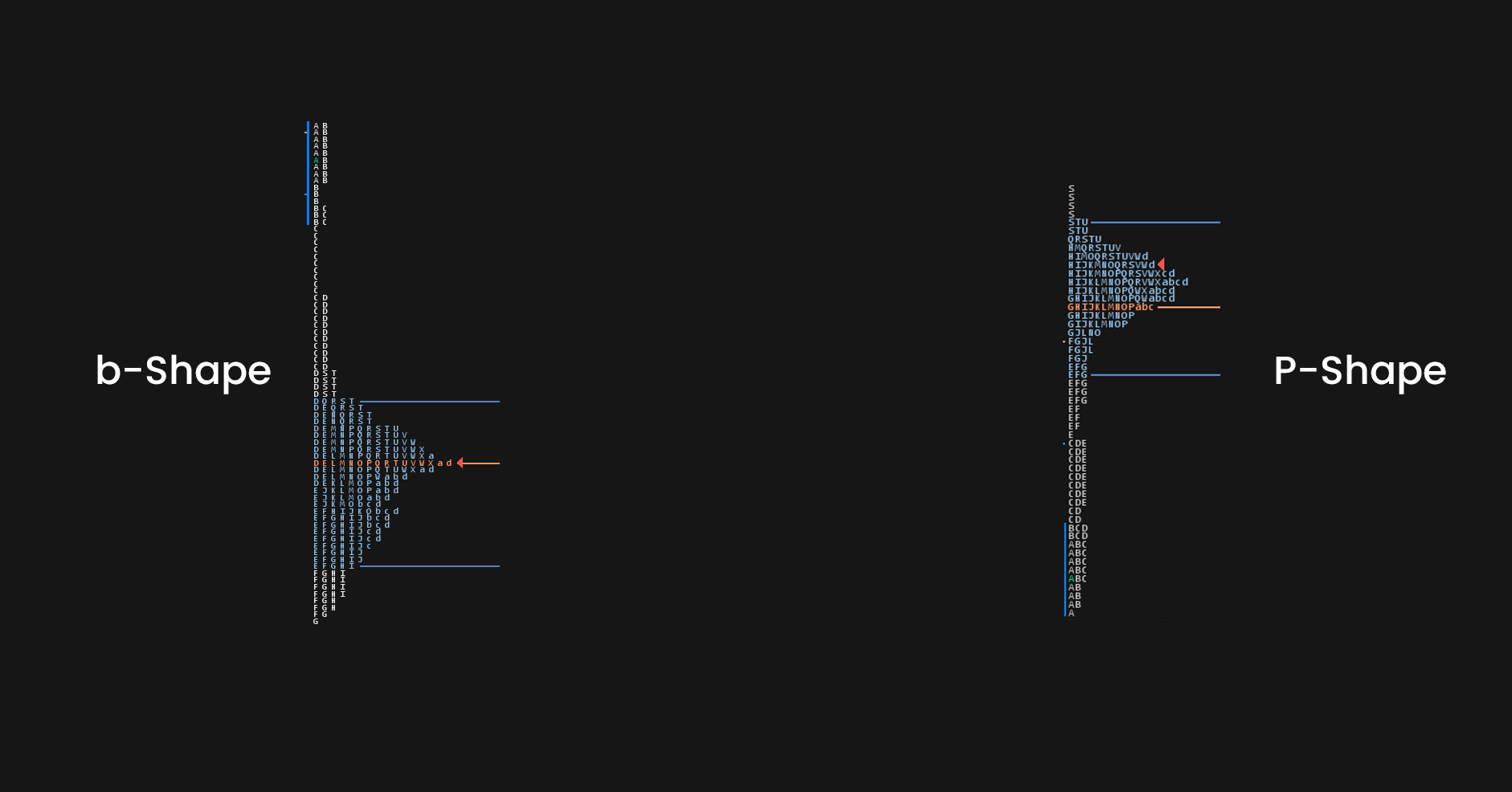
P-shape and B-shape
P-shape profile signals a short-covering which means that the market rally early in the sensing and spends the rest of the day distribution and creating a profile that looks like a letter P.
B-shape profile signals long exiting, the market drops early in the session, and spends the rest of its distributing, creating a profile that looks like letter b.
Market Profile opening types
Besides day types, we can also identify opening types in the market profile.
If we can identify these early on, we can jump into great movement in the session.
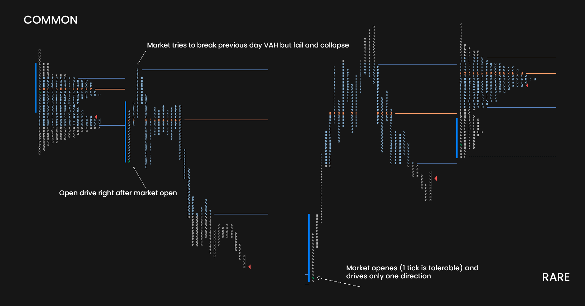
Open Drive
This open is defined by significant momentum right after the open.
The market opens (usually below/above the previous day value area) and trends with strong conviction.
When the market opens with an open drive, it means that no prices were traded above/below the open.
Most market profile courses and guides will tell you that you can never fade these moves, but more often than not open drives go and reach some key level such as previous day high/low, etc. and then fail.
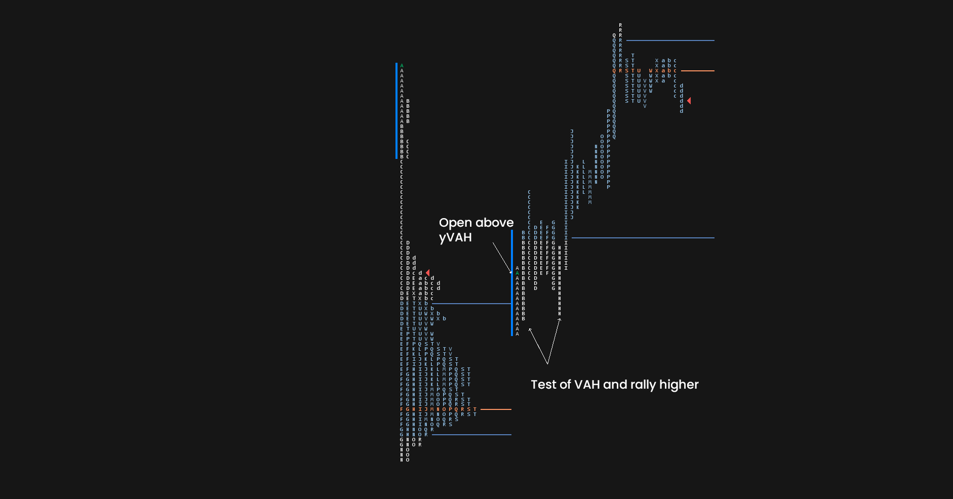
Open Test Drive
Same as an open drive but before rally/drop market tests the significant level.
Usually previous day VAH or VAL.
This is, in my opinion, much better compared to open drives as the market doesn’t just rally one direction but tests a significant level before that.
Open Rejection Reverse
This is the opposite of an Open drive, or in other words more common open drive.
The market opens, rally straight to the important level, and then fails and reverses.
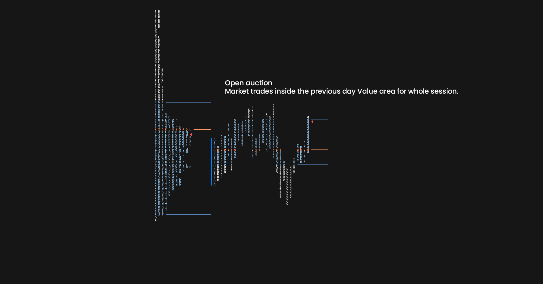
Open Auction
Tied to non-trending days.
The market opens with a lack of momentum and stays in balance for the whole session.
These are the bell curve-shaped profiles where you can scalp/daytrade around the edges of the value area.
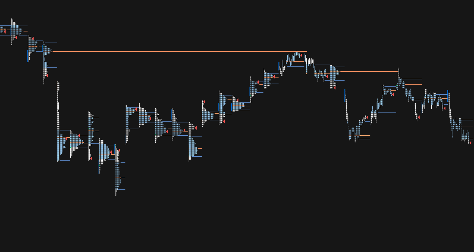
Composite Market Profiles
Besides watching the Market profile of the prior day, we can also build composite profiles.
A composite profile is every profile that contains 2 and more sessions.
We can have Market Profiles with fixed periodicity such as Weekly, Monthly, or Yearly Market profile.
Or we can merge Market profiles how we want.
When the market is in balance (range) and value areas overlap, we can merge them together to build composite market profiles.
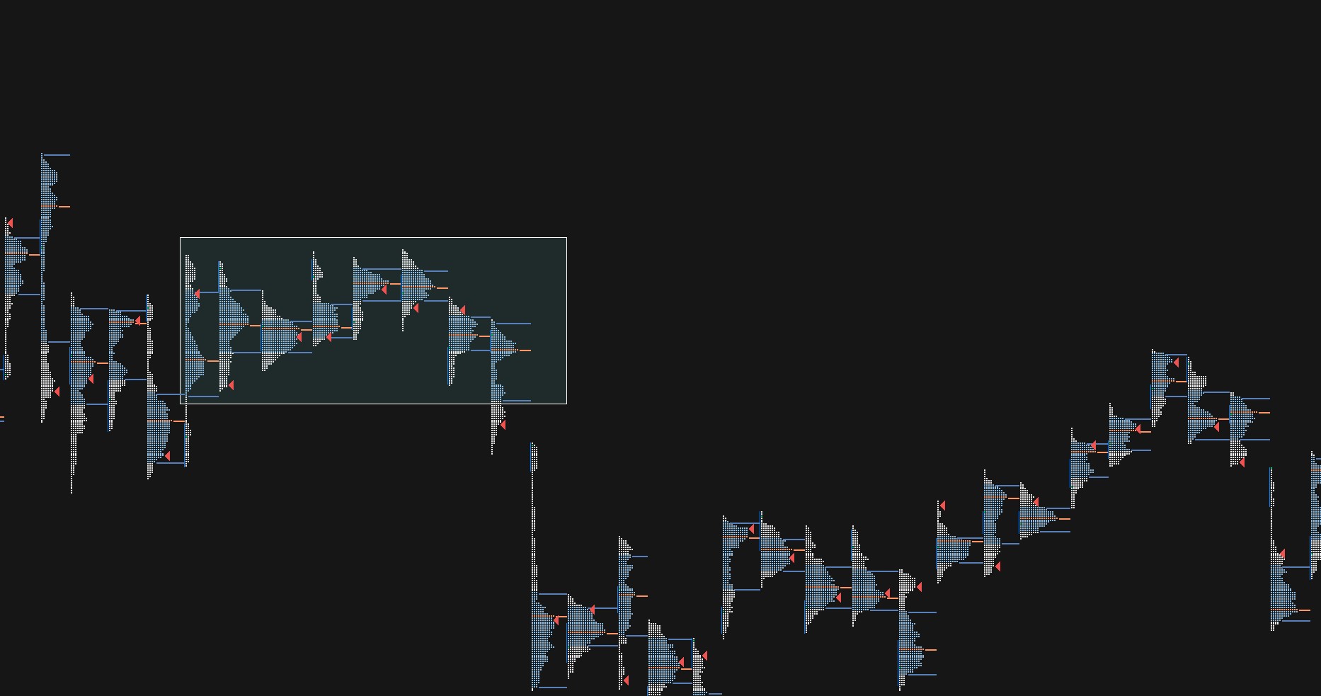
As you can see during these 8 days highlighted inside the rectangle, the Value area hasn’t shifted higher or lower from the first day of the range.
To get a clear picture, we can merge all of these together to get one big composite profile.
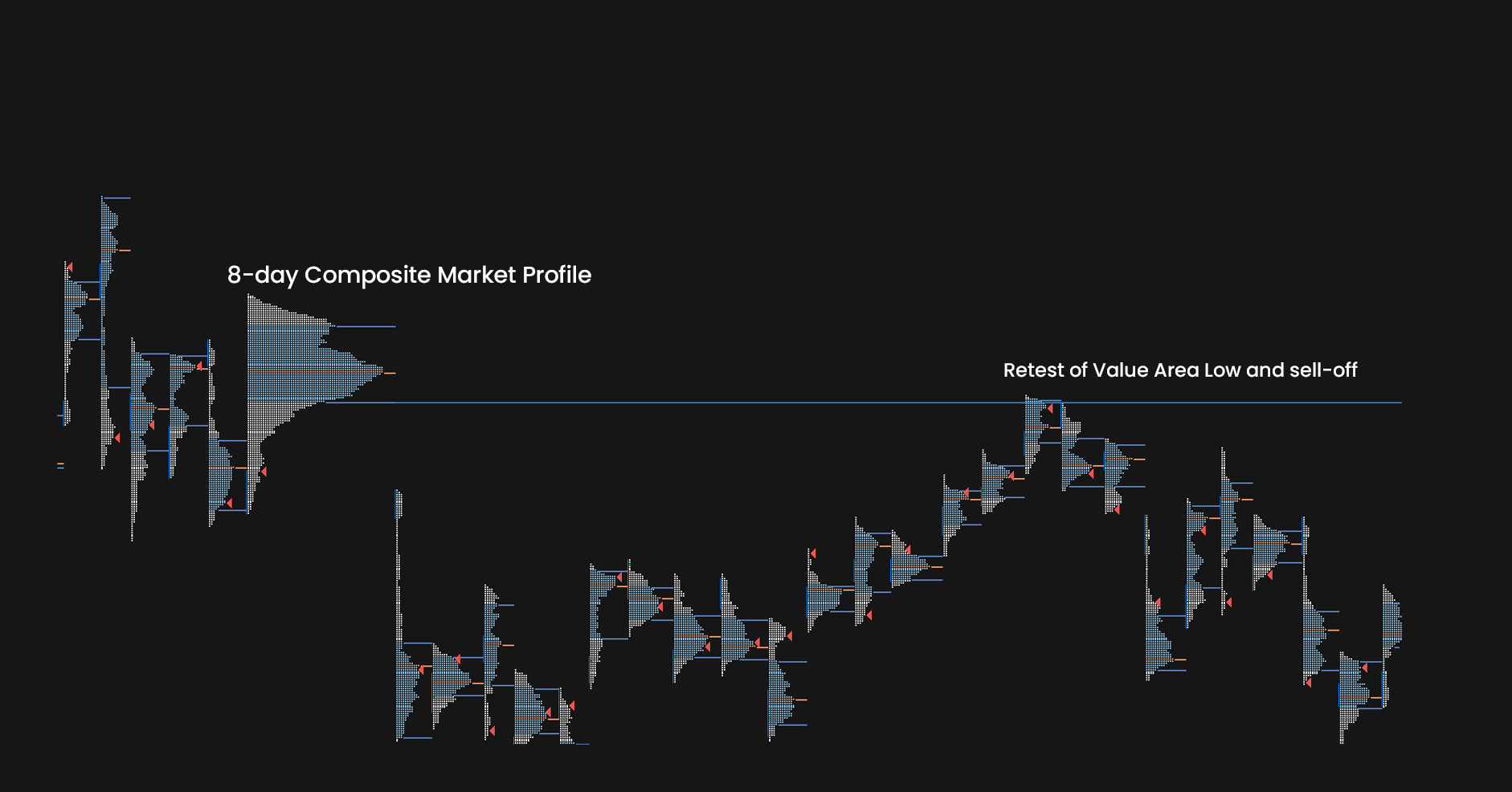
Once we merge all of these, we get one big distribution with value area and point of control.
As you can see, this level comes to play a few weeks later as resistance.
Merging market profiles is quite a subjective thing to do and takes a little bit of practice.
My best advice to be to only merge very obvious ones with overlapping values.
Market Profile 80% Rule
This is a very famous systematic strategy by Dalton.
It says that if the market opens above/below the previous day Value area and then accepts back inside the value with 2 TPOs (two 30-minute candles), there is an 80% chance to rotate to the other side of the value area.
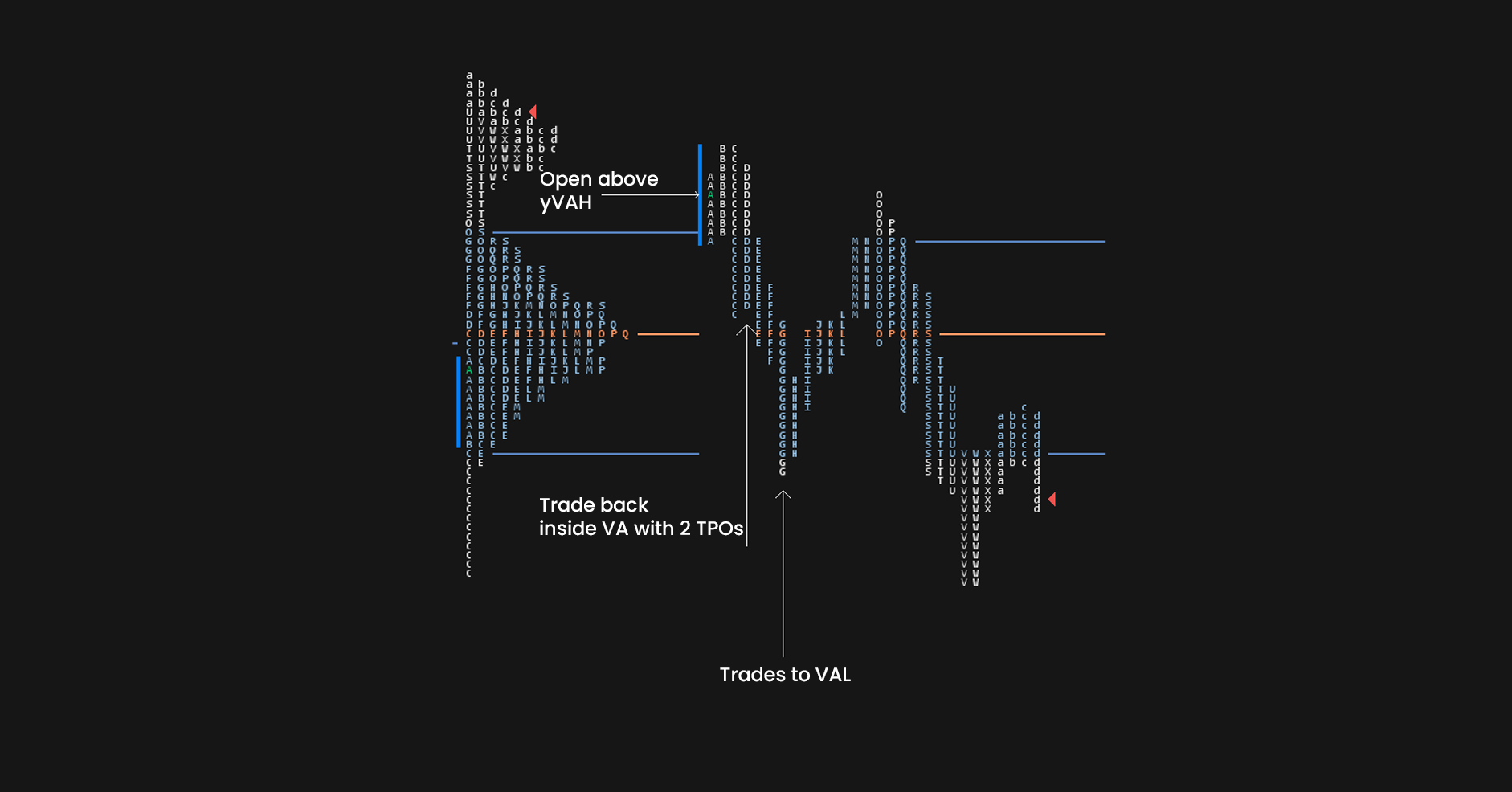
Are things simple and easy like this every time? No.
Should you blindly trade every acceptance into the previous day VA targeting another side of VA? No.
Although the idea of the 80% rule is great, I would never rely blindly on something having an 80% success rate without backtesting it.
Every market is different so although this rule can be used as a confluence for your trading idea; I don’t recommend trading it blindly.
Market Profile Software
Most of the examples from this article are from Euro Stoxx 50 and German 10-yr Bund.
For legacy futures trading, I recommend using the Sierra Chart.
If you are trading cryptocurrency, you should use either Sierra Chart or Exochart.
Exochart is cloud-based charting software that includes all popular crypto exchanges compared to only a few that are on Sierra.
In Conclusion
The market profile is an excellent tool for analyzing the market.
Although it looks intimidating at first, once you get a grasp of it, you will find it inseparable from your day-to-day trading.
I hope you found this article helpful and if you have any questions about Market Profile, feel free to leave a comment below.
Pingback: Trading with Volume Profile: Everything you need to know - Tradingriot.com
Dannu
HI! Thanks for this. About the opening types, how much time does it take before you can define this? Minutes, or up to ….?
Adam
Hi, I didn’t delete it, I have to manually approve all comments due to the fact there is a lot of bots spamming these posts.
About the open type, you usually know after the first hour of cash open.
Adam
Dannu
OMG, sorry, makes totally sense 🙂
Andrew
Awesome blog/content! Have you back tested placing orders around poor high/lows when they are retested? It seems at the very least you could get a piece of the excess that would occur there in the future. Also, do you used single prints as profit targets or do you find that price typically goes through them so you stay in the trade beyond where the single print occurred? Thanks!
Adam
Hi Andrew, cheers for the comment! I don’t place blind orders at poor highs/lows as I never place a limit order at prior resistance/support levels, simply because you can never know how deep the excess will be pretty much. It’s much smarter from my experience to wait for the level to probe first and when I see good excess and maybe some absorption on footprint, I am happy to enter. I use single prints as just one of many reference points in charts, I oftentimes used them as the target but also they are great entry points as you often have a good level above or below singles.
Adam
TheFlowGuy
What is the benefit using MP instead of VP if the volume is available for the actual market?
Actually i see many OF traders using only MP and I can’t understand why. So we could agree that volume is more significant than ‘time spending of price’. You can merge (and split) both of them, i think you can also apply most of the MP specific strategies in VP (80% rules -> f.e. day opens outside of the previous day VA you can watch if the price goes back and close inside in an hour in case of VP) also single print is when a price goes in 30m to a direction. Shape/distribution theories and patterns are the same.
So what is the point i can’t see as a benefit of MP?
Adam
Me and every I know are using MP but the calculations of value area and poc are based on volume, so It is pretty much a volume profile with graphical representation of market profile so you can still look at anomalies like poor highs/lows, singles etc.
TheFlowGuy
I see, it is a visual convenience.
Thanks
Eirik A
Hello!
I am new to your blog but it looks absolutely stunning.
I trade Forex based around stop runs with wicks, and I got the idea to find a tool to measure volume on the different price levels in a candle, to more effectively see if there is a lot of buying/selling in the wick, indicating that many stops have been triggered / a lot of pariring of orders.
I thought the footprint chart would be the thing, but I see from your comment that it does not work with Forex. I have also not found a footprint chart available for MT4, which is the platform I use.
Do you have any suggestion on what tool I can use in order to find what I want?
I will definately spend a lot of time here the upcoming days/weeks. I will probably also buy the “blueprint”, but will need to digest the free material first. Appreciate your efforts, thanks.
Adam
Hi,
it doest work in forex majors when you look at currency futures.
There is no way to have it in MT4, you need to use a platform such as Sierra Chart.
Eirik A
In my head it should be like a volume profile, but instead of having it on the side (measuring several candles), it should be displayed within each candle to see how many contracts were traded on the different price levels within the candle. If that makes sense?
Adam
Check this article out – https://tradingriot.com/footprint-charts
brad
Wow, you explain things really well. Very clear articulation and plain language. Love the clear visuals as well. Thanks so much.
PR
Amazing blog Adam sir!
Bez
Hey thanks for sharing this. Showing the times of the initial balance was very helpful. If you were setting up your volume profile for the Bund. What time do you have the close of the profile if you do not want to show the out of hours session??. 5pmGMT?
Adam
For Bund I do 8AM-10PM CEST